October, 2019 #
You’re reading the second Duet Design System monthly update. This update focuses on accessibility and performance updates that we’ve been working on.
During the past month we’ve focused on getting more components ready for production usage together with some big accessibility and performance improvements. At the time of writing, we now have 25 production ready components together with 5 example templates you can use.
Making all these new features accessible has become an important part of our workflow. While the new accessibility law requires us to do so, the more important part is that it allows us to improve the experience for everyone who uses our products. To achieve this, we’ve created an accessibility checklist that helps us remember to tick all the necessary boxes.
We’ve been also working on optimizing Duet’s packages for better performance. All packages now weigh around 90 KB combined which is pretty good, considering that this includes static assets as well. Current network footprints for different parts look like this:
- Web Components Runtime: 1.3 KB gzipped
- Design Tokens: 1.5 KB gzipped
- CSS Framework: 3 KB gzipped
- Fonts CSS: 300 bytes gzipped
- WOFF2 fonts: 46.6 KB
- All 302 icons combined: 43.9 KB
New this month #
In this section we’ll highlight every month new features and progress from Duet Design System. This month’s highlights include:
Visual Studio Code extension #
Visual Studio Code is an editor optimized for building modern web apps. To ease up the usage, we’ve created an extension that does autocompletion for Duet’s components and component properties.
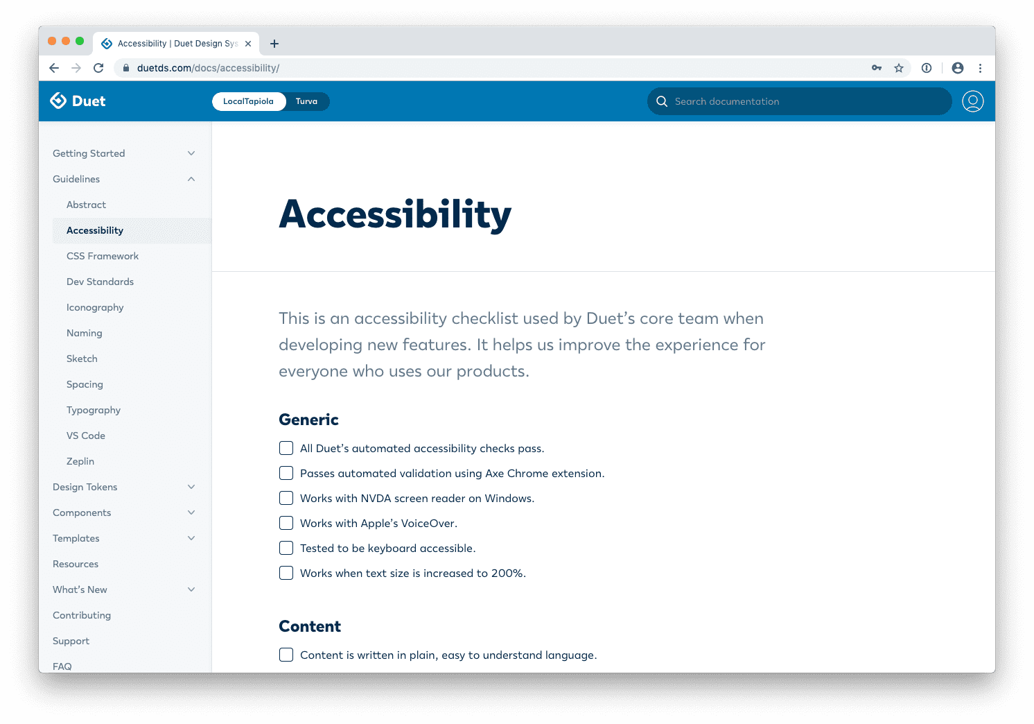
Accessibility checklist #
Accessibility checklist is a tool created and used by Duet’s core team when developing new features. It helps us improve the experience for everyone who uses our products and can be useful for other teams as well.
<!-- To change text colors -->
<p class="duet-color-primary">Text</p>
<p class="duet-color-secondary">Text</p>

<!-- To change background colors -->
<div class="duet-bg-primary"></div>
<div class="duet-bg-secondary"></div>

<!-- To change fills of SVGs -->
<svg class="duet-fill-primary"></svg>
<svg class="duet-fill-secondary"></svg>
CSS Framework #
Duet’s CSS Framework includes a wide range of shorthand utility classes to modify an element’s appearance in your own application. It’s also an useful companion to include on a page when using our components.
On the roadmap next #
- Getting more components ready for production usage is still our first priority at the moment. For an up-to-date list on progress and what’s under work, view component statuses.
- Our next priority is to support designers and developers who start utilizing these new parts. If you have any questions, please view support page and reach out.
- Finally, we’re also working on an internal tool that will allow us to measure Duet’s adoption and usage. This will help us understand where and how Duet is being used and how it affects the workflows of other teams.
What is Duet? #
Duet is a collection of reusable components and tools, guided by clear standards, that can be assembled together to build digital products for LocalTapiola and Turva.
The goal of Duet is to improve user interface consistency and quality, while making our software design and development processes more efficient.
The name “Duet” resembles the fact that there are two separate themes. One for LocalTapiola and one for Turva.
Duet has a core team of designers and developers inside LocalTapiola who are dedicated to building and supporting the system.
Until November!
Viljami Salminen